A few years ago, we had a client that hired us to improve the landing page conversion rate for one of their leadership coaching programs.
Their landing page had a great offer, the copywriting was great. The design looked ok, and they offered FREE Tony Robbins training!
HOWEVER, their conversions were about 25% down on their expectations, despite all their efforts…
It was costing them money.
They had invested a lot in building their program; they knew they had a great offer and they were also investing in pay-per-click advertising to put their program in front of well-chosen prospects.
Fortunately, they had good analytics installed, so we used them to maximum advantage.
Here’s what the numbers revealed:
Their analytics showed us that they had decent traffic however, people were visiting a range of other pages on their website because the visitors had questions:
• they wanted to know more about the people who were offering the training.
• they wanted to know more about the content of the training.
• they wanted to know about their privacy policy and their trading terms.
There were visitors clicking on the logo at the top of the page that took them to the home page, to see what else they did – they never came back to the offer page!
There were visitors who went off to read their blog and never came back.
There were visitors exploring the social links in the footer and never came back.
There were visitors clicking through to privacy and terms pages and never came back.
There watched the video, clicked on the YouTube logo, and never came back.
Overall, to get the answers to specific questions, those visitors were clicking links that took them to other pages and out to social sites AND THEY DIDN’T COME BACK!
Their cool-looking, the well-written landing page was leaking like a sieve!
So we fixed it by turning it into a mini-site and plugged all the leaks by using almost all of the techniques below…
The key message is: Don’t send traffic AWAY from your landing page
In our experience, one surprisingly common reason your visitors aren’t taking action is that your website is sending them away.
We’ve analyzed A LOT of client websites and landing pages, and we have seen many ways visitors who are interested in a product or service, end up clicking on links that take them away from the page.
When does it happen?
Most commonly, it happens when your visitors are trying to find more information about your offer, and then they get distracted, usually by a distraction that you created.
The farther away you take your users from your desired action step, the less likely they are to take action. And it’s a real problem that most business owners don’t realize they have.
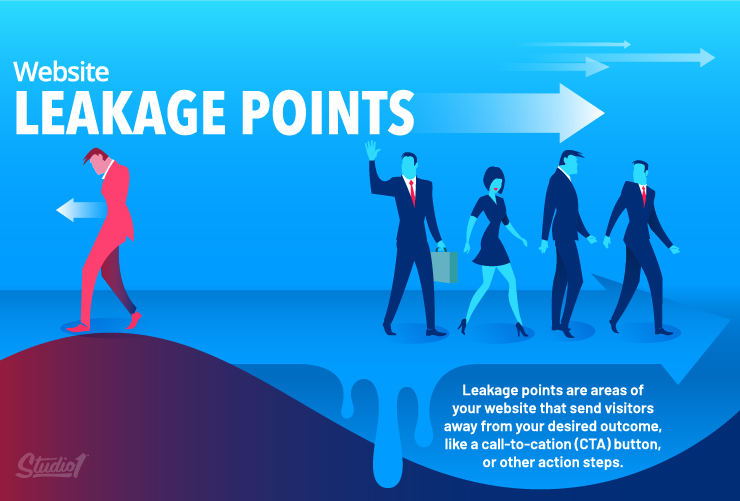
We call these ‘leakage points’.
Leakage points are areas of your website or landing page that send viewers away from your desired outcome, call-to-action (CTA) button, or another action step.
The main problem caused by leakage points is that your conversions go down.
Here are your action steps to eliminate leakage points:
1. Create a mini-site instead of a single landing page
For our client above with the conversion issue, we redesigned those three landing pages into a ‘mini-site.’ Here’s a short video of how the mini-site works:
Essentially, the mini-site looks the same as the main landing page. The difference is that when a user clicks on a link that takes them away from the landing page, we added the same CTA at the top and the bottom of each subsequent page.
Also, the “Privacy Policy” link, opens a pop-up where the entire privacy policy can be viewed. When the visitor has seen what they want, they close it – and they’re still on your landing page.
2. Remove all links to external websites
I see a lot of websites with social media icons above their top navigation. When pressed they take you off to those platforms. Even worse, is when the social media page opens in the same tab!
If you use videos on your website, use a paid video hosting platform like Wistia or Vimeo, to prevent people from clicking on the platform’s logo which will leak off to that website. A lot of people make the mistake of embedding YouTube videos on their website’s marketing pages. Only use YouTube videos on your blog/video/podcast pages.
3. Remove internal website links
If you’re sending traffic to a page on your website from ads, or social media, that page should only have one CTA (Call To Action). I know it’s tempting to show your visitors everything your business offers however, it’s super important to keep the focus on the single reason that you sent them there. Only give them one action to take.
4. Use Your Home Page To Segment
Your home page should be designed to position you as a trusted authority, showcase your unique offer to solve their problem, back up your claims with social proof, and then provide a clear pathway based on their intent.
Other Problems To Look Out For:
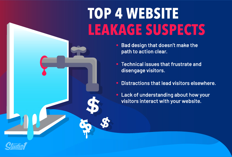
- Incorrect links in your CTA Buttons. These are simple errors to make, but they’re leakage points all the same. (And they’re surprisingly common.) If your users click on your CTA, but it sends them to the wrong destination, that’s a leak in your funnel.
- The browser and device display. Is your website displaying correctly across different browsers and devices? If it isn’t, then your users might not be seeing your website correctly which could frustrate them, and they leave.
- Too many distractions. Are your web pages cluttered with too much information? Each page on your website is to have a clear direction for the user to take. Otherwise, they end up distracted and not taking any action.
How to spot leakage points to improve your conversions
Leakage points differ per website. That’s why, apart from the basic troubleshooting list above, there’s no definitive list of leakage points to avoid.
Fortunately, you can gather actionable data using a conversion optimization strategy.
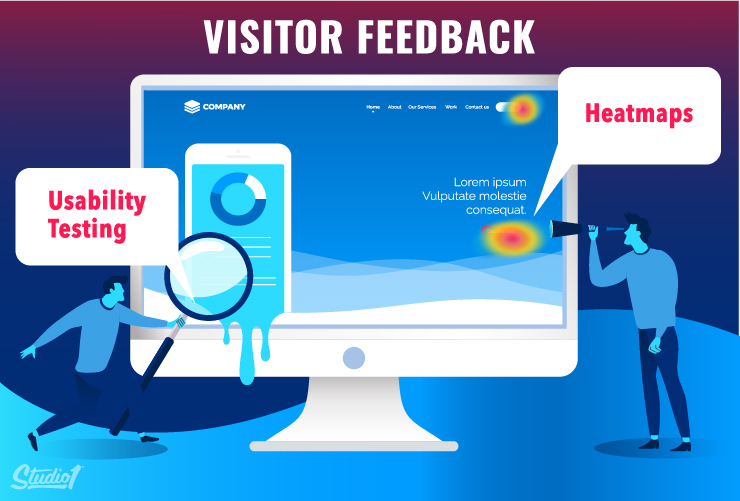
Conduct Usability Testing
Usability tests are where you watch how your visitors interact with your website. They can be done just by getting a group of users in a room and watching what they do. You can also do usability tests remotely with software tools that record every move your visitor makes on their screen.
(We have a whole blog post on usability testing coming soon).
The beauty of usability testing is that you see exactly what goes wrong.
Perhaps your users can’t easily see your CTA because it blends into your color scheme. Maybe they don’t understand your website copy. Or are they getting distracted by your blog or links to other pages on your website?
Don’t wonder – test and see…
Use Heatmaps
Heatmaps show you which areas of a web page get the most clicks.
If your users aren’t clicking on your CTAs, what are they clicking on?
Heatmaps answer that question and show you which photos, videos, links, or buttons get the most attention.
Split Test
From gathering the data above, you can hypothesize as to why these areas are more compelling than the ones you WANT your visitors to click on. Then create new design variations to split test to see which option is more effective.

Summary of How To Fix Leakage Points
Leakage points send away your website visitors from your desired action step, often because of confusing design or a technical issue.
Eliminate leakage points by removing all distractions that don’t lead to the action you want people to take.
Use your copywriting and website design in harmony to ensure visitors only take the action you want them to take.
Test your website for leakage – don’t just assume it’s optimized. Use heat maps, video recordings of your visitors, split testing, and usability testing to find out what’s actually going on.
Avoid leakage points by designing around your CTA, minimizing distractions, and potentially utilizing mini-sites.
If you’re using Pay-Per-Click advertising, or if you have invested in copywriting, then don’t let hidden leakage rob you of conversions.
We are a conversion-focused design agency, so if you need help identifying leakage points on your website, book a 15-minute strategy call here to speak with an expert.
